
Choosing the right color for your interior painting project might seem like a small decision, but if you’ve ever stood in front of a wall of paint swatches, you know it can be an overwhelming one. After all, the colors you choose can have a huge impact on the way your home looks and feels. Whether you’re updating a cozy Milwaukee bungalow or refreshing a newer build in the suburbs, your interior painting project deserves a thoughtful approach.
At JB Custom Drywall, we’ve spent over 30 years helping Southeastern Wisconsin homeowners transform their living spaces with skilled craftsmanship and straightforward service. From drywall to painting to framing to insulation, we treat every home like it’s our own because we know your home is more than just four walls.
If you’re thinking about starting an interior painting project, here’s how to confidently pick the perfect color.
Start With the Room’s Purpose
The rooms in your home are more than just their utility. Because color has a powerful effect on mood and because you spend a lot of your time in the different rooms of your home, you should think about how you want each room to feel.
Social Spaces (Living Room, Kitchen, Dining Room)
For gathering spaces, go warm. Shades like soft reds, buttery yellows, or welcoming terracottas create energy and encourage conversation. These are great picks for rooms where people linger and laugh.
Private Spaces (Bedrooms, Bathrooms, Home Offices)
In more personal or quiet spaces, cool tones are your friend. Blues, greens, and light grays help promote calm and focus. A misty blue can make a bedroom feel tranquil, while a subtle green adds focus to a home office without feeling sterile.
Think About the Room’s Size
Paint color can shape how large or small a room feels.
Small Rooms
Lighter colors like warm whites, creams, or pastels can make tight spaces feel brighter and more open. If you’re working with a smaller guest bedroom or a narrow hallway, go light and airy.
Larger Rooms
Got space to play with? Deeper tones can add coziness and sophistication. Charcoal, navy, or forest green can make a big room feel more grounded and intimate, as long as the lighting supports it (more on that below).
Pay Attention to Lighting
Light changes everything. A color that looks perfect in the store might look completely different in your home.
Natural Light
- Bright, sun-filled rooms can handle bolder or darker shades without feeling too heavy.
- Rooms with limited natural light do better with light-reflective hues that brighten things up.
Artificial Light
- LED bulbs tend to cool down a room, making blues and greens appear more stark.
- Incandescent bulbs warm things up and can make beige, red, and orange tones feel richer.
Pro Tip: Test swatches in your actual space under day and night conditions.
Follow the 60-30-10 Rule
This simple interior design trick keeps your color palette balanced:
- 60% of the room is your main color (usually the wall paint)
- 30% is a secondary color (furniture, rugs)
- 10% is your accent (throw pillows, artwork, decor)
It helps everything work together without being too matchy. Think of it as the rule of “just enough.”
Coordinate with Your Decor
Already have furniture, artwork, or a favorite rug you love? Great! You can use those pieces as your color anchors.
- Want your bold decor to stand out? Stick to neutral wall colors.
- Want to highlight crown molding or built-ins? Choose a paint color that creates contrast.
We’ve seen how the right paint choice can elevate every other feature in a room, even the floors!
Use the Color Wheel With Confidence
You don’t need to be a designer to pull off a great color scheme. Here’s a quick breakdown:
- Complementary colors (opposites on the wheel) offer bold contrast, which is great for statement-making spaces.
- Analogous colors (next to each other) feel cohesive and easy on the eyes.
- Cool tones (blues, greens, purples) evoke peace and calm.
- Warm tones (reds, yellows, oranges) bring energy and coziness.
Pro Tip: Pick a palette that supports the mood you’re going for and that you won’t get tired of in a month.
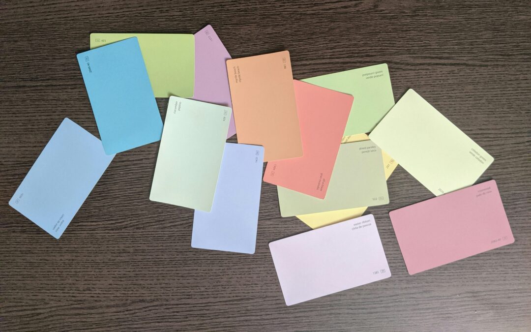
Test Your Paint Samples
Once you’ve narrowed down your options, grab some sample cans and paint swatches directly on your wall. We recommend testing paint samples in at least two places with different lighting.
Look at the samples during different times of day and in natural and artificial light– you’ll be surprised how much a color can shift.
Pro Tip: Paint a larger patch, about 2 ft x 2 ft, to get a better sense of how the color will feel on a whole wall.
Look for Outside Inspiration
If you’re still stuck, take a look at:
- Pinterest boards full of curated color palettes
- Design magazines that showcase real homes
- Remodeling shows for practical examples
- Local homes in your neighborhood–you might spot a color you love just driving through town.
Save your favorites and look for patterns in what you’re drawn to.
Bring Your Interior Painting Vision to Life
Congratulations–you’ve chosen the perfect interior paint color for your room! Now, it’s time to get it on the walls, and that’s where we come in!
The team at JB Custom Drywall takes pride in delivering clean lines, smooth finishes, and a hassle-free experience from start to finish. Our interior painting crews are fast, friendly, and detail-driven, and we treat every home like it’s our own.
We’re based right here in Southeastern Wisconsin and proudly serve homeowners who want top-tier quality without the runaround.
Ready to get started?
Contact JB Custom Drywall today to request your free, no-pressure quote. We’ll typically get back to you within 24 hours.
Let’s make your next project the easiest (and best-looking) one yet.
Recent Comments